Jordan Lyles was, in my opinion, a very good pickup for the Texas Rangers. In fact I would call him a bit of a bargain if he performs like he did with the Brewers the end of last year. It is important to understand what exactly he did last year. To dive into these baseball analytics I will be using R and the great package by Bill Petti, baseballr.
I pulled all of Jordan Lyles’ data for 2019. This post will illustrate the visualizations that are possible in an analysis like this and eventually deliver a conclusion about Lyles’ contribution to the Brewers. Just like there is methodology in the Software Development Life Cycle there is also a process in approaching a baseball analytics project. We won’t call this a data science project because we aren’t looking to build a model. We are simply doing what is called EDA (Exploratory Data Analysis). If we find something interesting then we further explore.
I am using R for this because I believe baseballr is more powerful than pybaseball however I will be making the CSVs available to anyone that wants them.
The roadmap for this will be doing 5 relatively simple visualizations to show what you can do with this data and to pose more questions.
Spin Rate vs. Release Speed
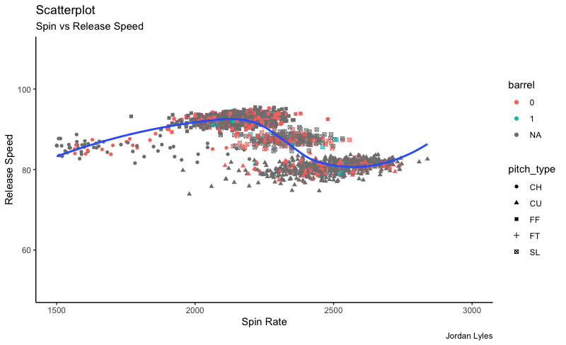
The first viz we are going to look at spin rate with release speed. To that I have added a best fit line. You can see the shape of that line. You can also see the spin rate and of all pitches thrown coupled with whether a hitter “barreled” the ball. I left NAs in there which means there was no contact whether that means a pitch was taken or a swing and miss.
Pitch Mix
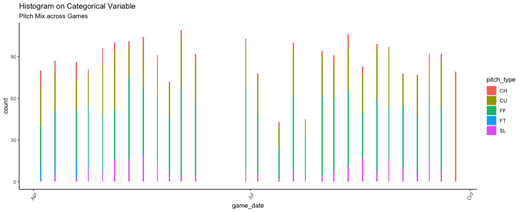
This next graph looks at Lyles’ pitch mix and overall pitch type per game. As you can see there was not much of a change with Lyles switched teams. I want to blunt the optimism that Lyles was some sort of different pitcher when he went to the Brewers. In fact his xFIP was higher with the Brewers.
Release Speed by Pitch Type
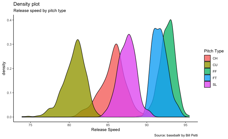
This next graph is a density plot categorized by pitch over release speed. We could even do this for spin rate. It can show distribution of the continuous variable you are looking at. This can also be valuable for pitchers to show gaps in release speed for pitches. Ideally you want to see some separation from peaks for starting pitchers. This actually looks pretty good.
Pitch Features
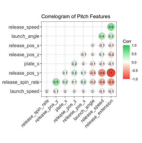
This was graph was one of my favorite. This is called a correlogram. This allows us to examine correlations between multiple continuous variables. I want to draw your attention to two main aspects. Look at launch speed. There is NO correlation between launch speed and release speed or spin rate. That is huge. This is true for Lyles and I am almost positive it is true for all others. However there is an interesting relatively small correlation between release speed and launch angle. That is something to look at.
There is also a curious correlation between release speed and release extension. As a pitcher that would be reasonable as it always seemed I would extend more on a fastball than on a breaking pitch. Looking at the further you see an inverse relationship between spin rate and release extension so that is what happening. So perhaps this is something biomechanically a pitching coach could use software to play around with to perhaps impact spin rate and release speed? Again, something to looking into.
Consistency of Release Speeds
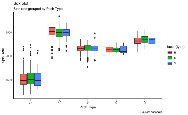
Lastly, we are going to take a look at the consistency of release speeds based on result of the pitch. B and S are self-explanatory and X means that the ball was contacted. This just shows consistency.
Conclusion and Further Research
This was a very high level view of Lyles’ season. I did not read The Athletic’s piece on Lyles and I am sure it was well done however I like to do my own research. At first I was excited about adding Lyles based upon his performance with the Brewers but nothing really shows he did anything differently. This did bring up some mechanical questions we can look at when it comes to release extension and spin rate. I did not split off that correlogram by pitch which would be interesting. Also, Lyles’ game on 9/25 did not register release speed therefore all of those pitches registered as changeups. I accounted for this.
Lyles is who he is. I would expect a WAR of 1 to 1.5. I do not think he repeat his performance with the Brewers. The being said a pitcher who can make 25-28 starts at the back end of the rotation with fairly positive results does have some value. I really like ZiPS’s prediction 1.4 fWAR but I do believe that is more on the high end for him. If you want to look at “simpler” statistics do not be surprised by a high 4 ERA from Lyles if we even play this season.
I will be doing analyses like these for every starting player on the Rangers roster as we await the start of the season and then I will expanding my analyses to answering questions we come up with as well as looking at the overall baseball environment. Let me know if you want the CSV files and I can send you the google drive link as well as the scripts used to create these visualizations.
Please be safe, smart and kind. I miss baseball.
Michael Cave
Data Scientist
Michael played baseball at the collegiate level as a pitcher at the University of Dallas. After graduation, he began a career in finance and eventually transitioned to more analytical roles as he built skills in R and then Python.
Michael has held the positions of Data Scientist, Senior Data Scientist, and Chief Data Scientist. He enjoys marrying a love of sports with a passion for all things data science. This has allowed him to look at baseball with a different perspective than when he was playing, His experience in the game allows him to ask different questions than others would. In his free time he enjoys spending time with his immediate family in the DMV.

Recent Comments